
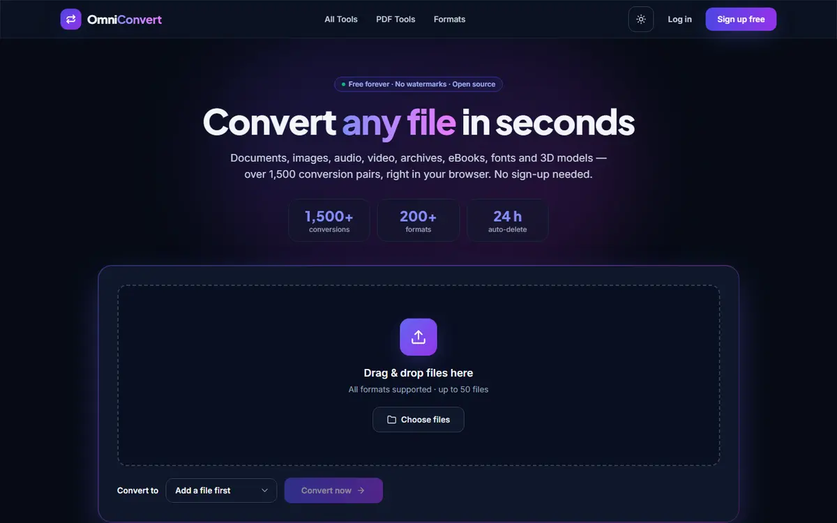
Designing around a single job
Tools like this fail in a predictable way. They accumulate options - format pickers, quality sliders, account prompts - until the user has to make four decisions before the thing they came for happens. The design brief was to make the default path require none.
Drop a file, get the sensible output, with everything else available but out of the way. Advanced options exist and are one click deep rather than in the primary flow.
What is actually hard here
- Format coverage is a long tail: the common conversions are easy and the last ten per cent is most of the work.
- Large files break naive interfaces. Progress has to be honest, including when something will take a while.
- OCR is a different mental model from conversion and had to be presented as its own path rather than hidden inside a format dropdown.
- No-account tools still need to communicate what happens to a file after it is processed. Silence on that question loses trust.
How the interface holds up
The whole tool is usable on a phone, which is unusual in this category and the reason a good share of people reach for it: file conversion is frequently something you need while away from a desk, and desktop-only tools simply fail at that moment.
Want a site that works this hard?
Tell us what a visitor should do when they land - call, book, buy or read - and you get a page structure, a timeline and one fixed price back.