
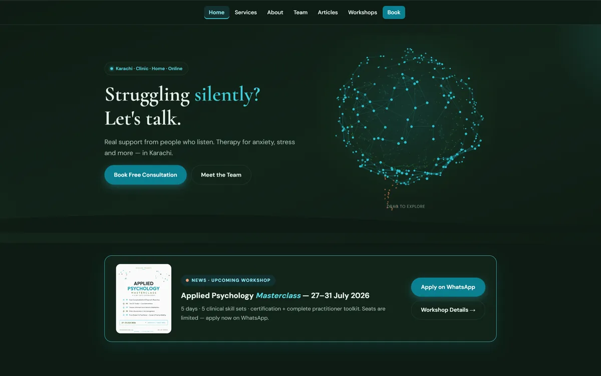
What the site had to do
Two things, and they pull in opposite directions. It has to feel calm and unhurried, because the visitor is often in distress. It also has to get somebody to a booking in as few decisions as possible, because a long journey is where people quietly give up.
The resolution is a warm, slow-moving surface with a very short path underneath it: a visitor can reach a named clinician and a booking route from anywhere without ever meeting a wall of text.
Building it in two languages
Bilingual is not translation bolted on at the end. It changes layout: line lengths differ, headings wrap differently, and a design tuned to English typography will look broken in Urdu. Both languages were laid out as first-class versions rather than one being derived from the other.
- Every string has a counterpart, including error messages and form labels, which is where bilingual sites usually leak.
- Type sizes are set per language rather than shared, because the same point size does not read equally in both scripts.
- The language switch persists, so a returning visitor is not sent back to the default.
The team directory is the point
In healthcare, the single most reassuring thing a website can publish is who you will actually see. The directory carries each clinician with their specialism, which turns an anonymous clinic into a set of named people - the same reasoning behind publishing our own team pages.
Want a site that works this hard?
Tell us what a visitor should do when they land - call, book, buy or read - and you get a page structure, a timeline and one fixed price back.