
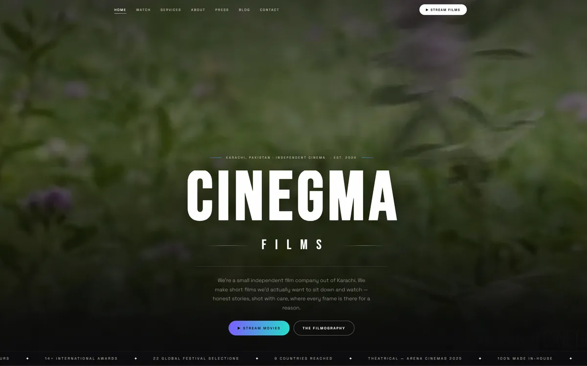
What the site had to do
A director, editor and colorist working under one banner needs a site that behaves like a showreel with an index attached, not like a brochure. The commissioning decision is emotional and fast: somebody watches thirty seconds of work and either wants to talk or does not.
So the structure is inverted from a normal service site. Work leads, credentials follow, and the contact route is available from every point in the scroll rather than parked at the bottom.
Why it is dark
Dark interfaces are frequently a style choice. Here they are a functional one: a light page around a video frame raises the perceived black level of the footage and flattens the grade the colorist was paid to produce. A dark surround lets the image carry its own contrast.
The consequence is that every other element has to be designed twice - type contrast, focus states and form fields all behave differently against a dark ground, and accessible contrast is harder to hit, not easier.
How it was built
- Video is loaded on demand rather than on page load, so a phone on mobile data reaches the page quickly and only pays for what is played.
- Poster frames are chosen deliberately rather than auto-generated, because the still is doing the selling until playback starts.
- Project pages carry credits and roles, which is what other production people scan for.
- Layout is built to survive a reel being replaced, since the work changes far more often than the site does.
Want a site that works this hard?
Tell us what a visitor should do when they land - call, book, buy or read - and you get a page structure, a timeline and one fixed price back.