
On this page
Why evidence is the interface
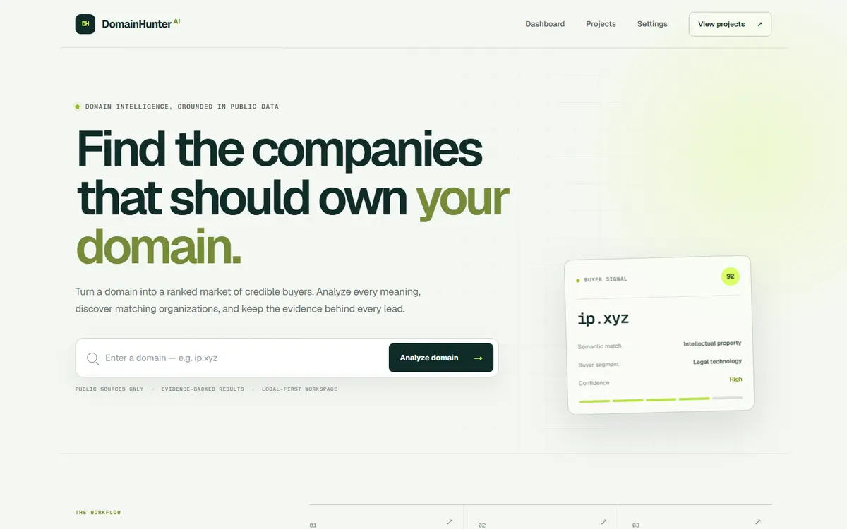
Any tool that ranks things creates an immediate credibility problem: why is this at the top? A ranked list with no reasoning gets used twice and abandoned. So the design keeps the public-source evidence attached to each lead rather than discarding it after scoring, and makes it reachable in one interaction.
That single decision shaped the layout. Rows had to be expandable without losing position in the list, and the evidence had to be readable rather than a raw data dump.
Designing a dashboard that does not sprawl
- One primary view. Analytics products tend to grow a navigation rail nobody uses; this stays a single working surface.
- Dense typography with real hierarchy, because the user is scanning rather than reading.
- Dark interface, since this is a tool people keep open for long sessions rather than visit briefly.
- Empty and loading states designed as first-class screens, because research runs are not instant and an unexplained wait reads as a broken tool.
What it demonstrates
This is the end of the range where design and build stop being separable. Screens are drawn against real data shapes rather than pretty placeholders, because a layout that only works with short, tidy strings will fall apart the first time a real company name arrives.
Want a site that works this hard?
Tell us what a visitor should do when they land - call, book, buy or read - and you get a page structure, a timeline and one fixed price back.